You are using an out of date browser. It may not display this or other websites correctly.
You should upgrade or use an alternative browser.
You should upgrade or use an alternative browser.
Beer Labels And Logos
- Thread starter Franko
- Start date

Help Support Australia & New Zealand Homebrewing Forum:
This site may earn a commission from merchant affiliate
links, including eBay, Amazon, and others.
Cocko
Oh Dear..
Man some awesome work done here lads!
Wish I had the skills - unfortunately when it comes to being creative like this I just fail
What name and theme do you want? I will bang something up 4 ya if ya want?
Brewery Name?
Beer type?
bcp
poפ ɹǝǝq
- Joined
- 6/9/09
- Messages
- 583
- Reaction score
- 16
If I am gonna comment I guess I should show my current:
Side writing is just fill...
Lovely use of understated colour. Just that element of warmth against the cool grey. Very nice.
Cocko
Oh Dear..
Lovely use of understated colour. Just that element of warmth against the cool grey. Very nice.
Cheers mate... its one of the trees from my balcony! Obviously, we sit high on a hill....
I love simple and modern tones - f%^k traditional beer label themes! AND ending every brewery/label name in 'brewery' !!
manticle
Standing up for the Aussie Bottler
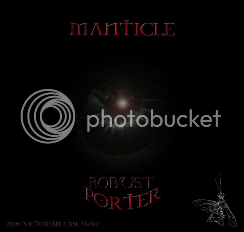
This is mine from the last Vic case swap. It's likely I'd only really bother making them for events like that - bugger doing it for every bottle I down in my own company but some ocassions warrant special attention.
Possibly a bit dark but suits both me and the beer.

Possibly a bit dark but suits both me and the beer.

Cocko
Oh Dear..
This is mine from the last Vic case swap. It's likely I'd only really bother making them for events like that - bugger doing it for every bottle I down in my own company but some ocassions warrant special attention.
Possibly a bit dark but suits both me and the beer.

Bro, THAT is amazing! [Says Giger/tool fan]
I have never even printed one, mine are CS3 practice.. thus far!
How TF did you make that centre image or is that google imaged? [NB: I have seen your drawings so know you may have produced that] BUT have to ask?
BTW: You should make a label out of those grey scale drawing you posted.... a cicada, or similar from memory!
manticle
Standing up for the Aussie Bottler
Centre image was from a scan I took of a millipede (gently placed in scanner and scanned till I got a good one). Then photoshopping effects (usually try and keep those simple and to a minimum to avoid making stuff look over effected or obviously, generically photoshopped). The wasp on the right was from a pen drawing I did but obviously inverted.
Definitely considering a pencil drawn cicada or wasp for the next one.
Cheers mate.
Definitely considering a pencil drawn cicada or wasp for the next one.
Cheers mate.
petesbrew
Lover of Beer
- Joined
- 31/3/06
- Messages
- 5,198
- Reaction score
- 172
Awesome work BCP!Here are three more. Three brilliant recipes from folk on this site.
An American IPA - fourstar's recipe.
View attachment 37396
Manticle's robust porter - by manticle.
View attachment 37398
And screwy's irish red ale recipe
View attachment 37397
elronalds
Well-Known Member
I created this label over the past two nights, needs a few adjustments still.
Has anyone added these on kegerator tap handles? I thought maybe you could get a decal that is included on replacement handles. I doubt anything like the Andale decals would fit on my cheapo kegerator font. Sorry if this has been asked before but I did try searching and have looked at the sponsors options (I'd prefer a flat decal though).

Has anyone added these on kegerator tap handles? I thought maybe you could get a decal that is included on replacement handles. I doubt anything like the Andale decals would fit on my cheapo kegerator font. Sorry if this has been asked before but I did try searching and have looked at the sponsors options (I'd prefer a flat decal though).

bum
Not entitled to an opinion
- Joined
- 19/2/09
- Messages
- 11,585
- Reaction score
- 911
No idea about the question but may I make a small suggestion about the adjustments required to the image, if I may be so bold?
Thanks.
Since the dude is in silhouette you could easily delete the black hairstyle to make the 'hawk look a little more convincing. And perhaps make the anarchy symbol larger - maybe even so large the pissing dude obscures some of it (but still off-centre).
Thanks.
Since the dude is in silhouette you could easily delete the black hairstyle to make the 'hawk look a little more convincing. And perhaps make the anarchy symbol larger - maybe even so large the pissing dude obscures some of it (but still off-centre).
elronalds
Well-Known Member
Since the dude is in silhouette you could easily delete the black hairstyle to make the 'hawk look a little more convincing. And perhaps make the anarchy symbol larger - maybe even so large the pissing dude obscures some of it (but still off-centre).
Yeah I was looking at the mohawk after I uploaded it and thought it could be improved. It was originally graffiti that I converted to vector format so it could be more detailed. Thanks for the suggestions, i'll fix those tomorrow night
elronalds
Well-Known Member
I finished a few adjustments that bum suggested, still not sure about the top font style and the grey hair part, improved the mohawk a bit though.
Does anyone know where you can get some waterproof stickers printed that I could put on my kegs? Thought there might be some online service that can do a small quantity. My printer decided it doesn't want to work anymore and I am not sure about the waterproof adhesive paper that you can buy.

Does anyone know where you can get some waterproof stickers printed that I could put on my kegs? Thought there might be some online service that can do a small quantity. My printer decided it doesn't want to work anymore and I am not sure about the waterproof adhesive paper that you can buy.

browndog
Are you bulletproof boy?
- Joined
- 23/9/03
- Messages
- 3,635
- Reaction score
- 157
I finished a few adjustments that bum suggested, still not sure about the top font style and the grey hair part, improved the mohawk a bit though.
Does anyone know where you can get some waterproof stickers printed that I could put on my kegs? Thought there might be some online service that can do a small quantity. My printer decided it doesn't want to work anymore and I am not sure about the waterproof adhesive paper that you can buy.
For the stickers you need to PM Warb, he does a lot for the guys here. Could I just mention that it's a bit difficult to read the writing from center left top to right, there is not enough contrast.
cheers
Browndog
Cocko
Oh Dear..
Could I just mention that it's a bit difficult to read the writing from center left top to right, there is not enough contrast.
cheers
Browndog
Agreed. Try the the text centre colour in the same as the mohawk colour and it might tie in??
Don't know - just sayin....
2c.
MarkBastard
Well-Known Member
- Joined
- 19/5/08
- Messages
- 3,857
- Reaction score
- 49
that punk piss pale ale doesn't sound too appealing
elronalds
Well-Known Member
Thanks for all the suggestions, yeah I need to fix the top text to make it clearer.
elronalds
Well-Known Member
that punk piss pale ale doesn't sound too appealing
Yep, hopefully my mates will think twice about drinking all my fine brew :unsure:
Batz
Batz Brewery...Hand crafted beers from the 'Batcav
- Joined
- 8/8/03
- Messages
- 12,737
- Reaction score
- 1,421
For the stickers you need to PM Warb, he does a lot for the guys here. Could I just mention that it's a bit difficult to read the writing from center left top to right, there is not enough contrast.
cheers
Browndog
He may not read his PM's all that often, here's his site. Great products and service by the way, he does all my stickers.
http://www.esigns.com.au/index.php?option=...1&Itemid=58
Batz
Similar threads
- Replies
- 4
- Views
- 3K
- Replies
- 13
- Views
- 5K
- Replies
- 50
- Views
- 10K
- Replies
- 7
- Views
- 3K
- Replies
- 0
- Views
- 2K


